As Hivelocity prepares to make several key announcements regarding additional data centers and new product offerings they have introduced a fresh new logo that foretells great things to come. The new logo further emphasizes Hivelocity’s “clean and easy” design philosophy first introduced with SparkNode and most recently with the Hivelocity.net makeover.
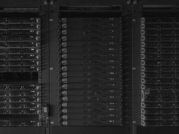
Hivelocity’s logo is simple yet manages to have dual symbolism. The capital H mark, with it’s 2 horizontal lines, depicts both the first letter of the company as well as a server rack. “Our approach to web hosting and infrastructure as a service has always been to make things simple for our customers. While we deal with complex technology there is no reason things have to be difficult for our customers. Our message of simplicity has always been clear but some of our imagery has not always matched the idea. Our old logo was much more abstract and represented speed through high-energy motion. Our new mark holds true to that message but now conveys speed through simplicity and efficiency,” says Mike Architetto, Hivelocity CEO. “Our goal is to make life easier on our customers by providing a hosting environment that is easy, reliable and facilitates their success. I believe our new logo symbolizes that message beautifully. “
Hivelocity’s clean and easy design philosophy can be found at Hivelocity.net, SparkNode.com and within their customer portal myVelocity.


